Improvost
An Illinois App Redesign
about the project

Fall 2025 - 4 weeks
Self-Driven Project
Submitted to UIUC Idea Fair 2025
Team: Mayank Mohapatra
I contributed:
UI/UX design on Figma
Concept development and design
SwiftUI experimentation
Improvost completely reimagines what a modern, polished, and student-centered app for a university campus could be.
The current app for the University of Illinois Urbana-Champaign does not embody the excellence and technological advancement of the university.
This project aims to bring responsive user experiences, long-awaited features requested by students, and updates to features that students use most.
the problem
As a first-semester freshman at the University of Illinois Urbana-Champaign, I began to use the university's own in-house mobile app for resources such as dining hall menus, campus maps, and student-based communities.
The Illinois app is plagued with:
nonsensical app organization
high interaction costs
drastic inconsistencies
poor visual design
user research
Surveying 50 users showed that:
75% use the Illinois app regularly
80% are freshmen students
3.44/5 stars app rating (69%, a D grade)
Students want:
customization
faster loading
menu accuracy
bus times
better organization
building information
dark mode
better organization
bus times
faster loading
menu accuracy
easier wallet
laundry availability
customization
glassmorphism
dark mode
app experience
crime map
Anonymized Microsoft Forms survey conducted in November 2025 with a sample size of 50 UIUC students.
(re)design principles
Reducing Interaction Cost
Using most-used features should be easily and quickly accessible without reaching back and forth across the screen, pointless scrolling, or tapping through an excessive number of pages.
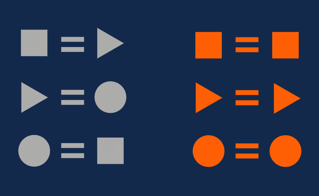
Adding Intuitive Interactions
Buttons are larger, responsive, and sensibly repositioned.
Some controls also make way for implicit buttons and swiping gestures.
Cleaning Up Interfaces
Screens are appropriately populated with what matters to you, in the moment. Additional features and information are placed elsewhere without interrupting what matters.
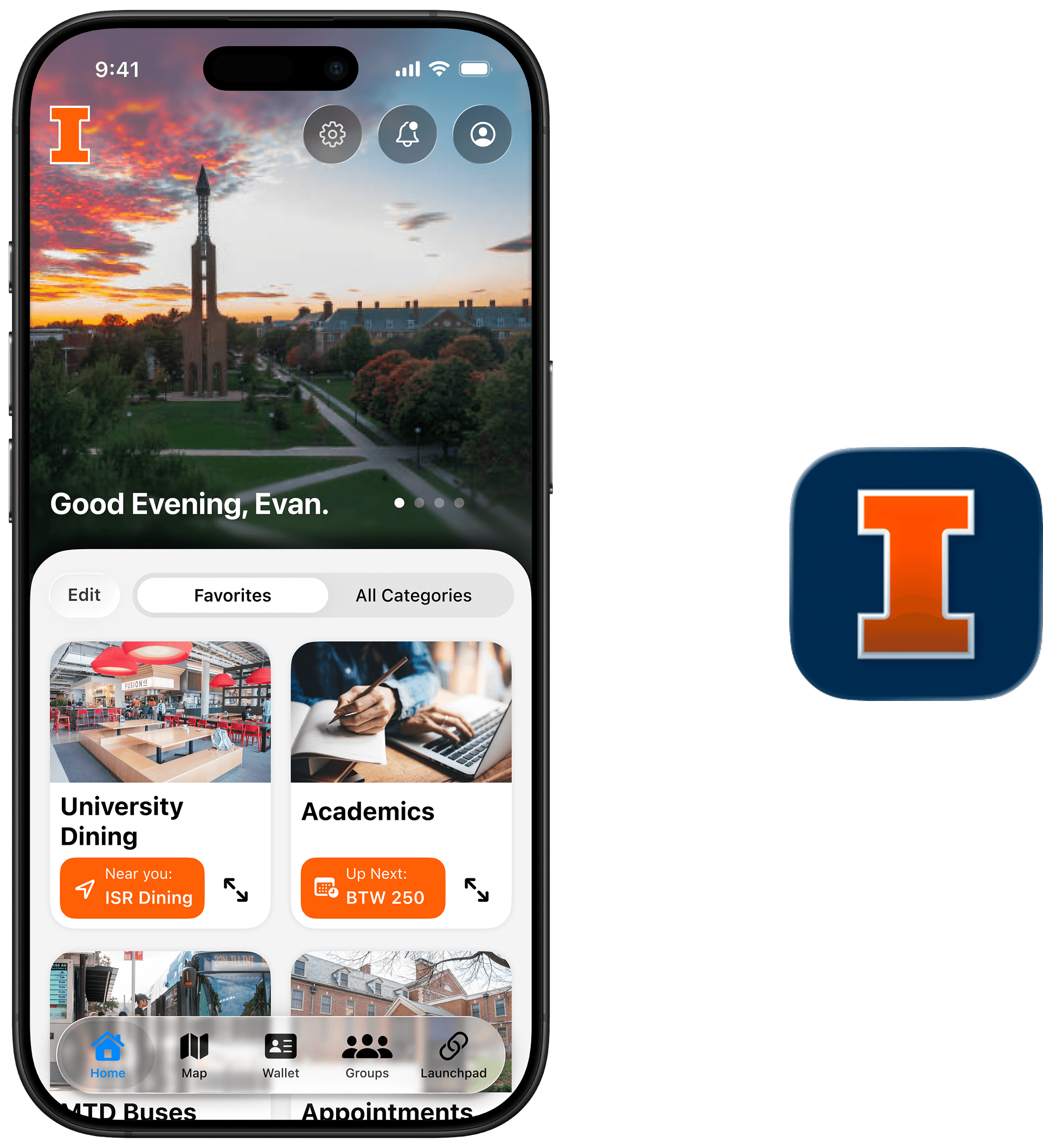
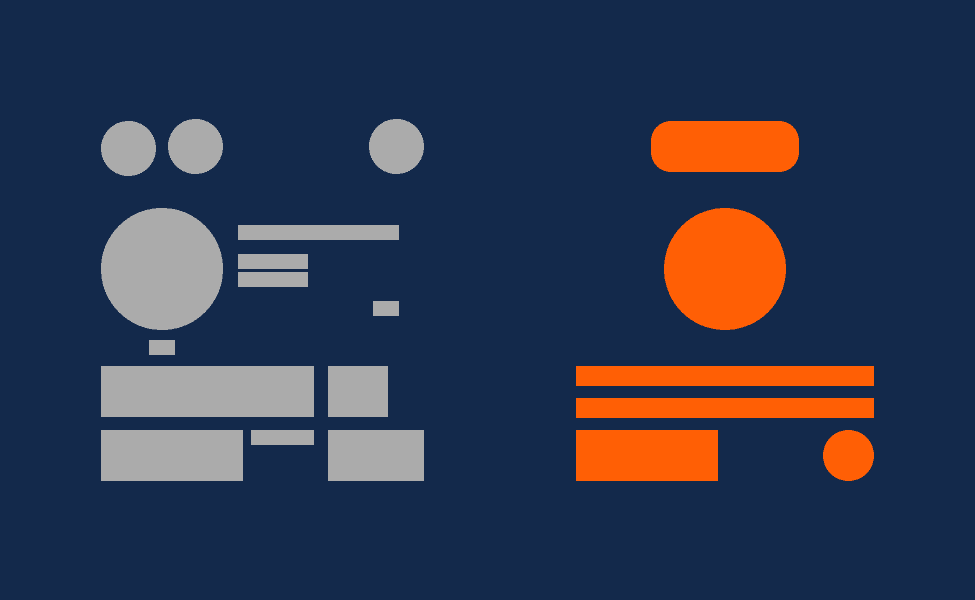
what changed? here are some highlights and details.
hover over each concept image to see its corresponding version in the current app.
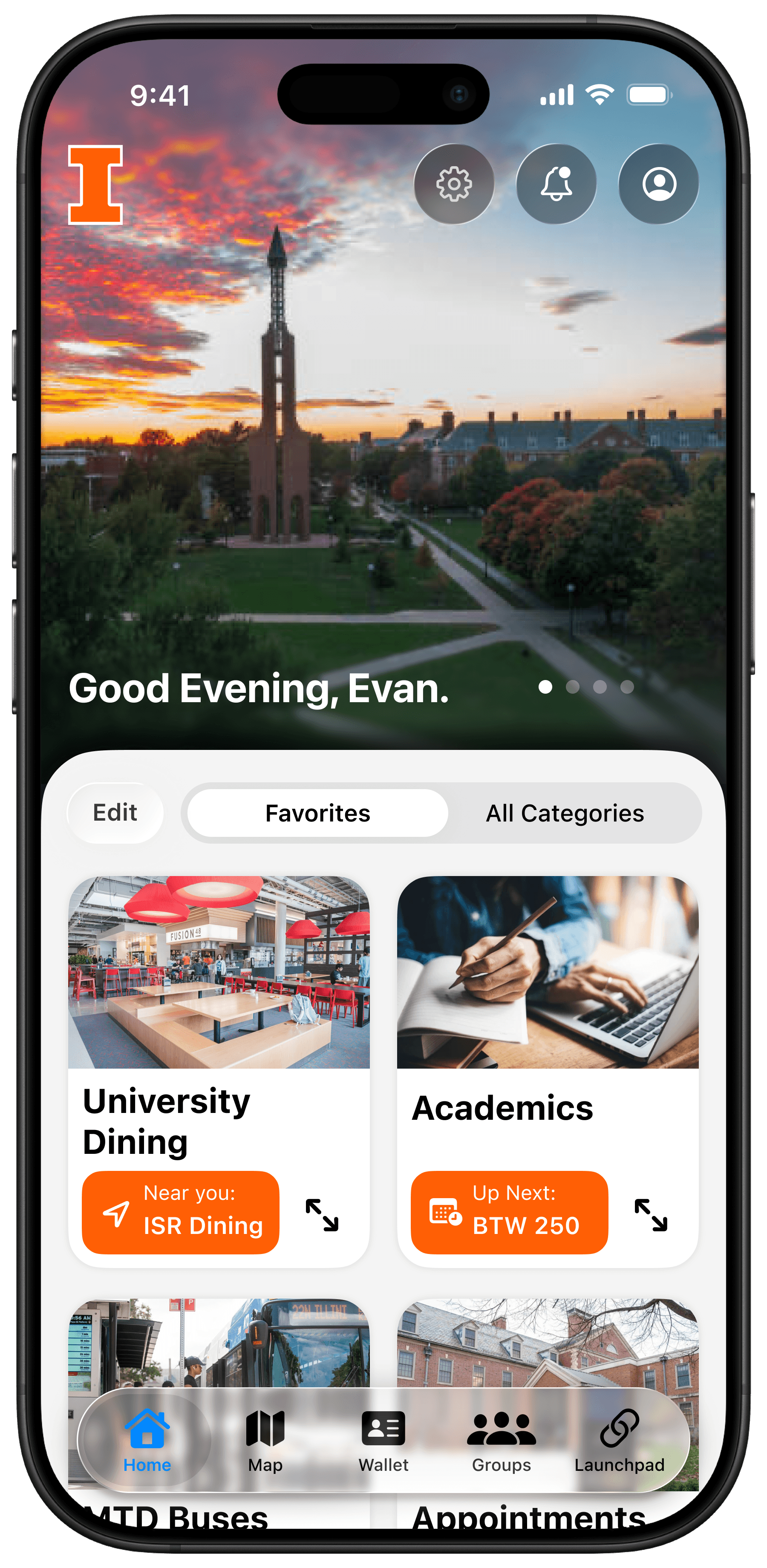
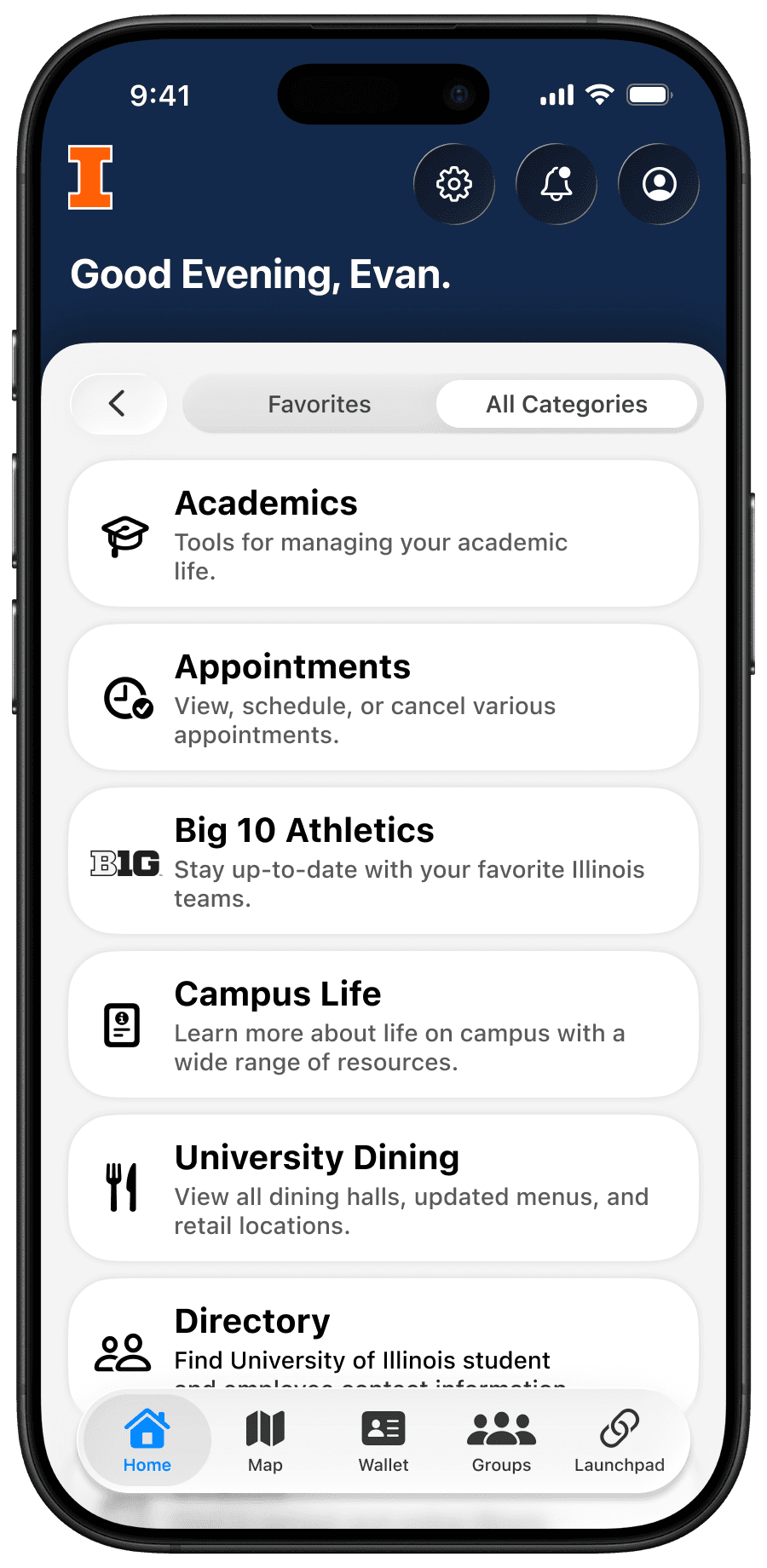
Default View
All Categories
Switchable and immersive banner images.
Relocating primary controls to be in reach.
Simplified choices.
Favorites Tab
XL grid layout
Quickly identifiable cover images
Contextual shortcuts
All Categories Tab
Comfortably listed
Simplified categories
Clear SF Symbol icons
Wallet
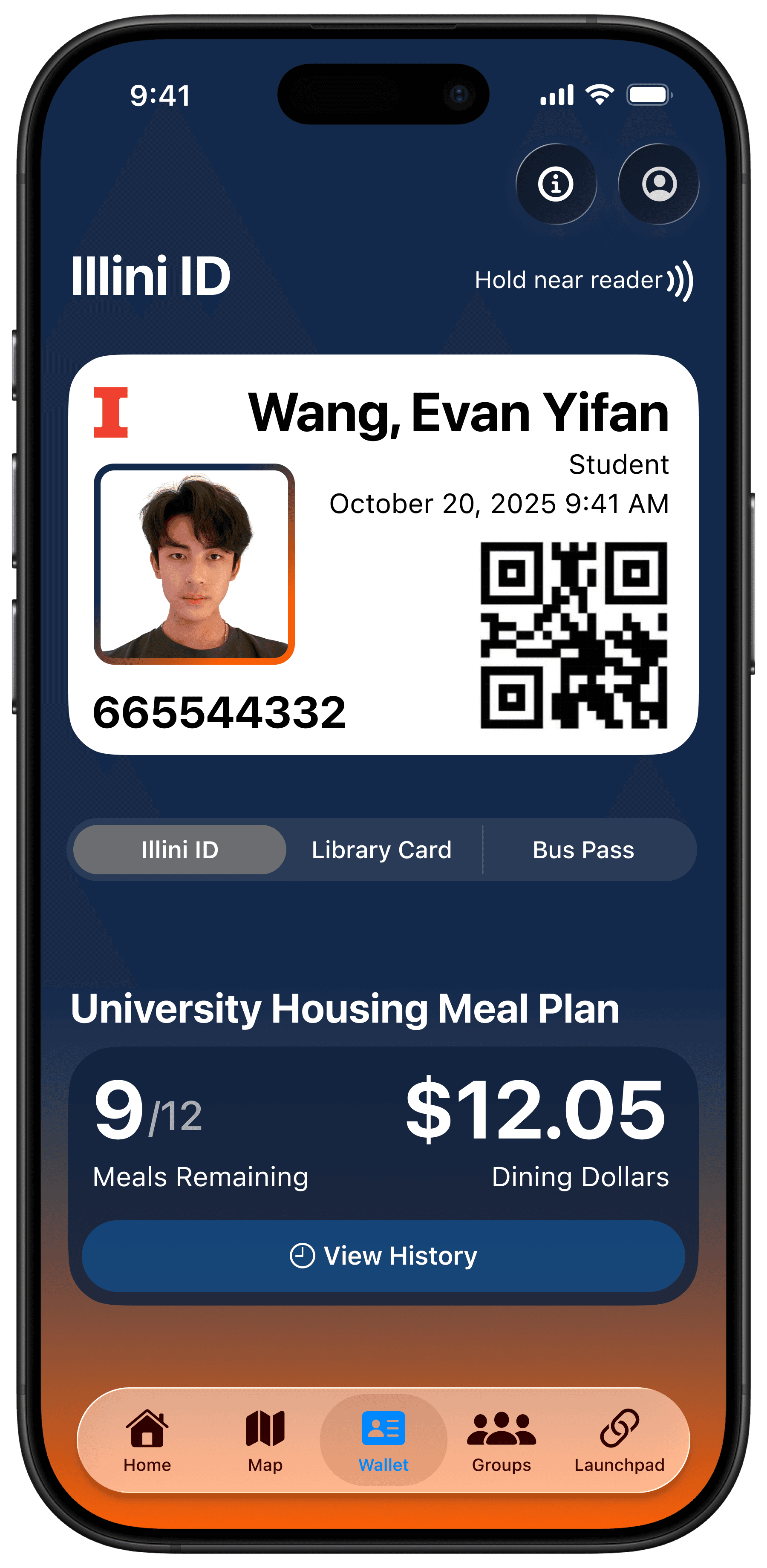
Student ID
Quick swiping between cards
Practical layout
Immediate Meal Plan information
Currently, there's a lot of
reaching
picking
scrolling
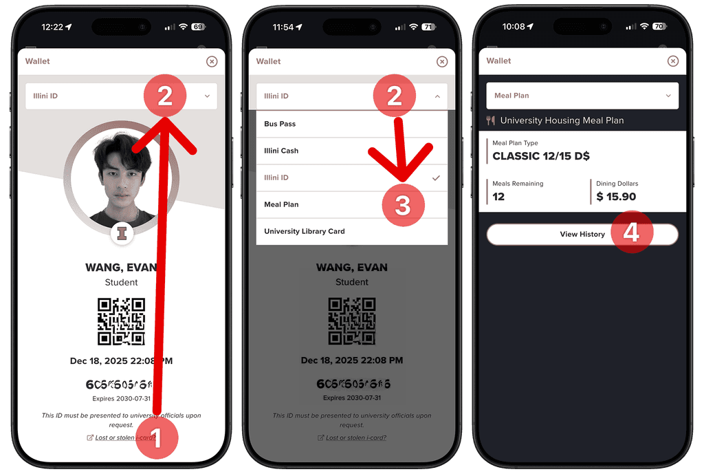
4 steps
2 drastically different locations
1 indiscernible dropdown menu
just to view my Meal Plan History.
Dining
Cooked up something new.
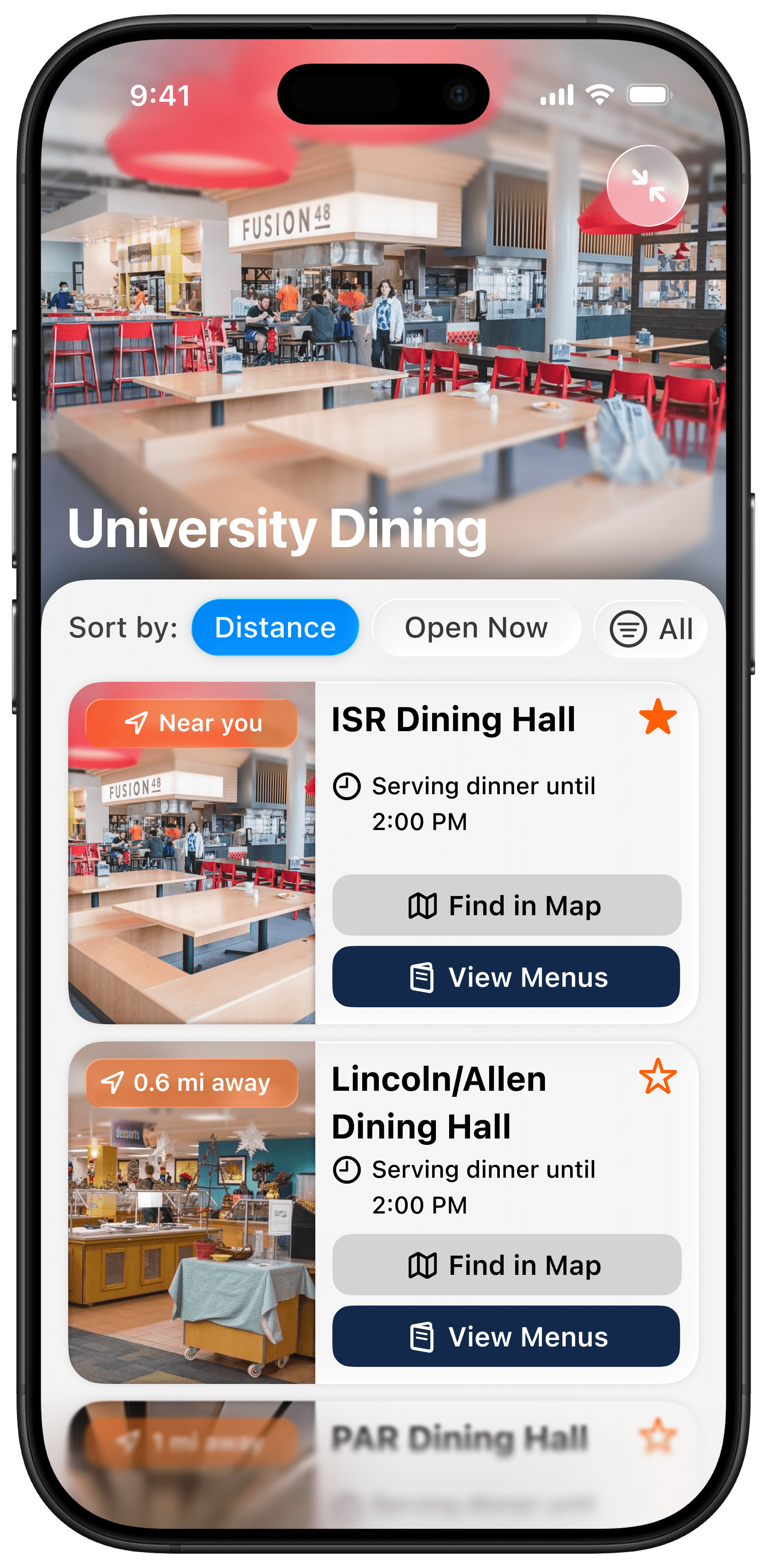
Dining Halls
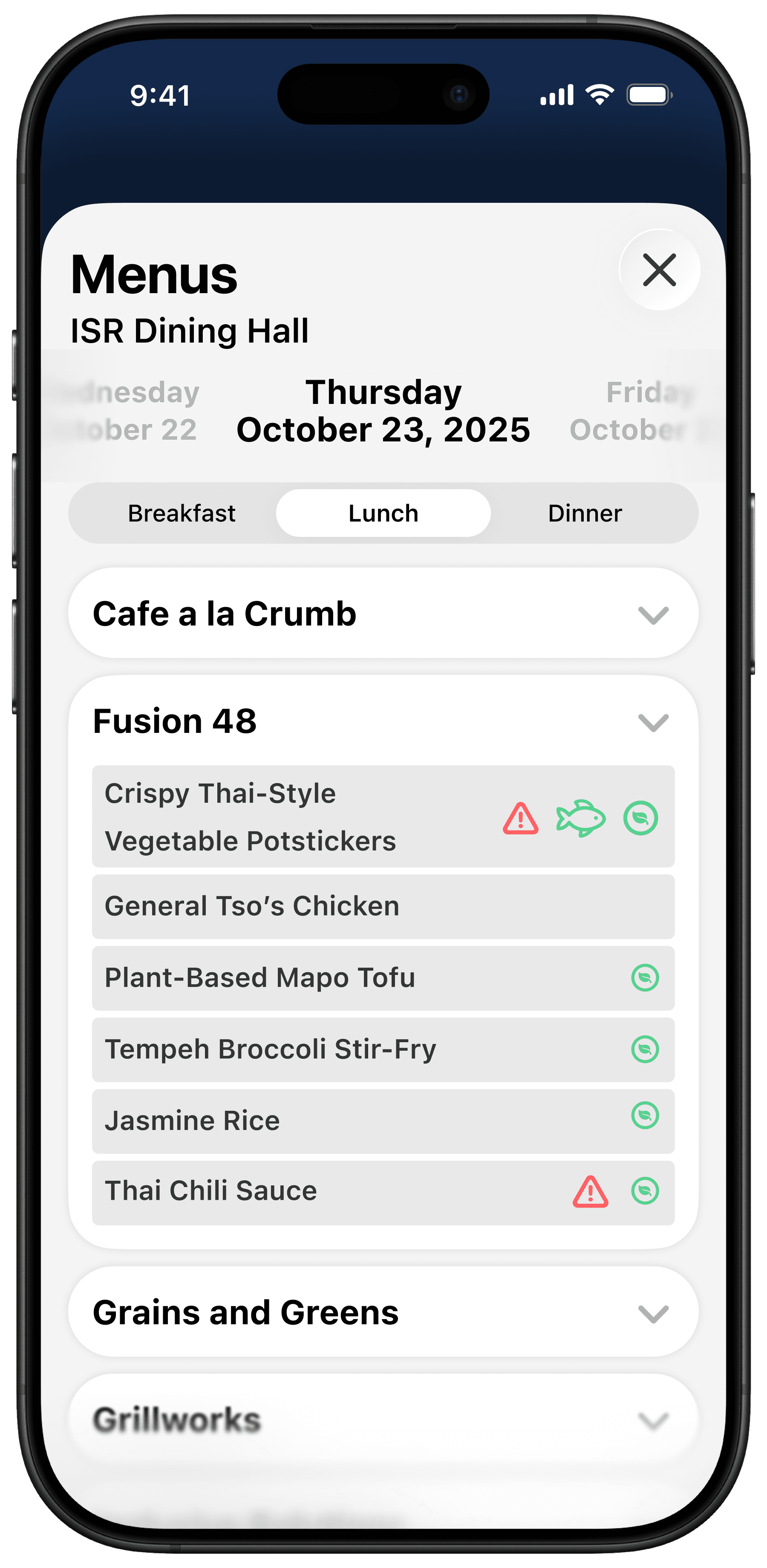
Menus
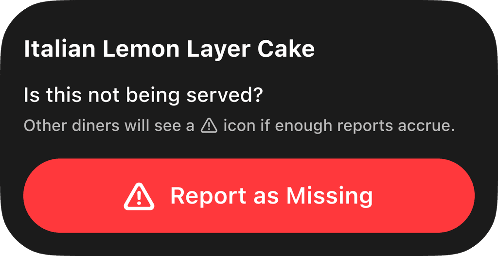
Is your favorite dish missing?
Report it.
Map, Groups, and Launchpad
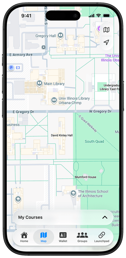
Map
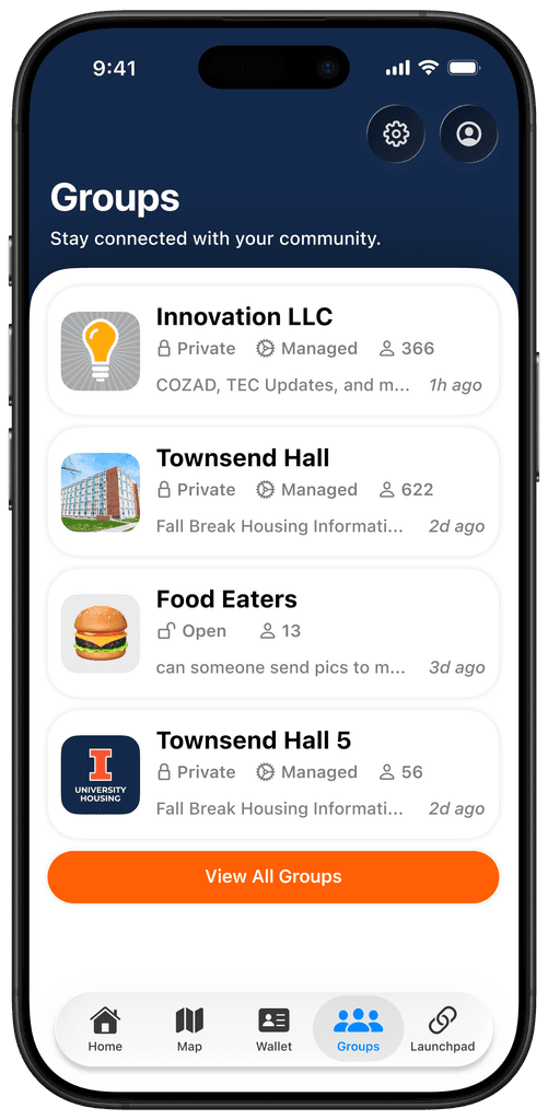
Groups (moved to Tab Bar)
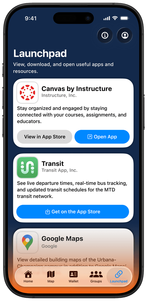
Launchpad (New)
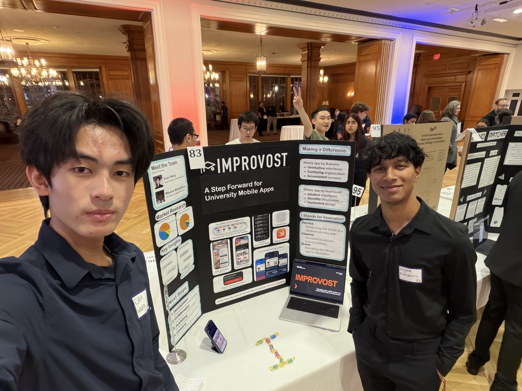
Improvost at the Idea Fair
Improvost was created as a project for the UIUC TEC's Idea Fair in December 2025.
We had the opportunity to pitch the project to judges and describe how Improvost would be an impactful improvement for one of the strongest links between students and the university.
We didn't win anything, but I got to work on my first expansive and objective-driven UI/UX design project.
Pictured on the right: myself and my teammate Mayank at our Idea Fair table with a trifold poster and interactive demo.
end of this project page.